On 20 April 2020, the U.S. Geological Survey (USGS) released the first-ever comprehensive digital geologic map of the Moon. The USGS described this high-resolution map as follows:
“The lunar map, called the ‘Unified Geologic Map of the Moon,’ will serve as the definitive blueprint of the moon’s surface geology for future human missions and will be invaluable for the international scientific community, educators and the public-at-large.”
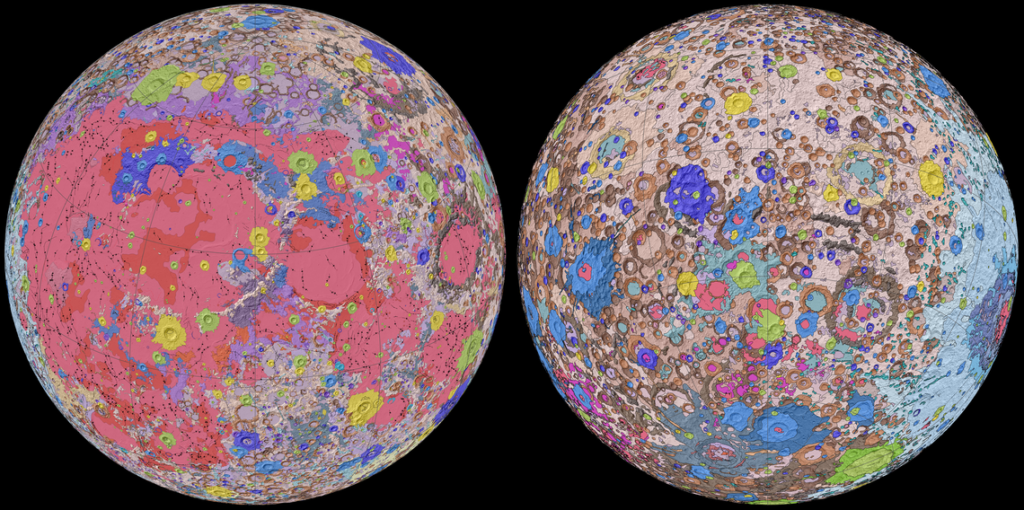
Color-coded orthographic projections of the “Unified Geologic Map of the Moon” showing the geology of the Moon’s near side (left) and far side (right). Source: NASA/GSFC/USGS
This remarkable mapping product is the culmination of a decades-long project that started with the synthesis of six Apollo-era (late 1960s – 1970s) regional geologic maps that had been individually digitized and released in 2013 but not integrated into a single, consistent lunar map.
This intermediate mapping product was updated based on data from the following more recent lunar satellite missions:
The Lunar Reconnaissance Orbiter Camera (LROC) is a system of three cameras that capture high resolution black and white images and moderate resolution multi-spectral images of the lunar surface: http://lroc.sese.asu.edu
Topography for the north and south poles was supplemented with Lunar Orbiter Laser Altimeter (LOLA) data: https://lola.gsfc.nasa.gov
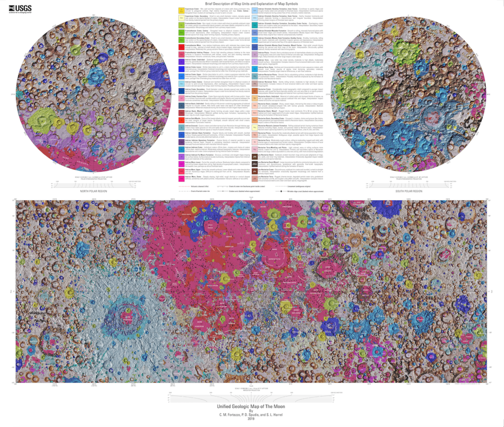
The final product is a seamless, globally consistent map that is available in several formats: geographic information system (GIS) format at 1:5,000,000-scale, PDF format at 1:10,000,000-scale, and jpeg format.
At the following link, you can download a large zip file (310 Mb) that contains a jpeg file (>24 Mb) with a Mercator projection of the lunar surface between 57°N and 57°S latitude, two polar stereographic projections of the polar regions from 55°N and 55°S latitudes to the poles, and a description of the symbols and color coding used in the maps.
These high-resolution maps are great for exploring the lunar surface in detail. A low-resolution copy (not suitable for browsing) is reproduced below.
For more information on the Unified Geologic Map of the Moon, refer to the paper by C. M. Fortezzo, et al., “Release of the digital Unified Global Geologic Map of the Moon at 1:5,000,000-scale,” which is available here: https://www.hou.usra.edu/meetings/lpsc2020/pdf/2760.pdf
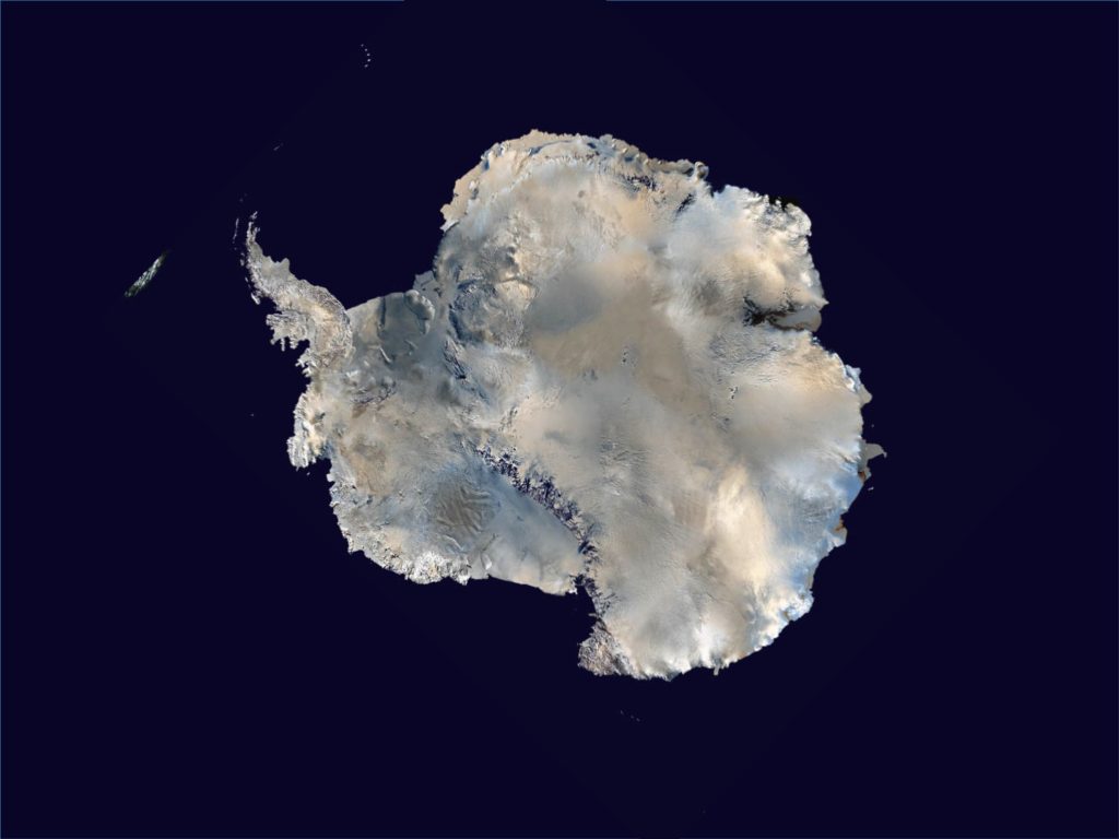
From space, Antarctica gives the appearance of a large, ice-covered continental land mass surrounded by the Southern Ocean. The satellite photo mosaic, below, reinforces that illusion. Very little ice-free rock is visible, and it’s hard to distinguish between the continental ice sheet and ice shelves that extend into the sea.
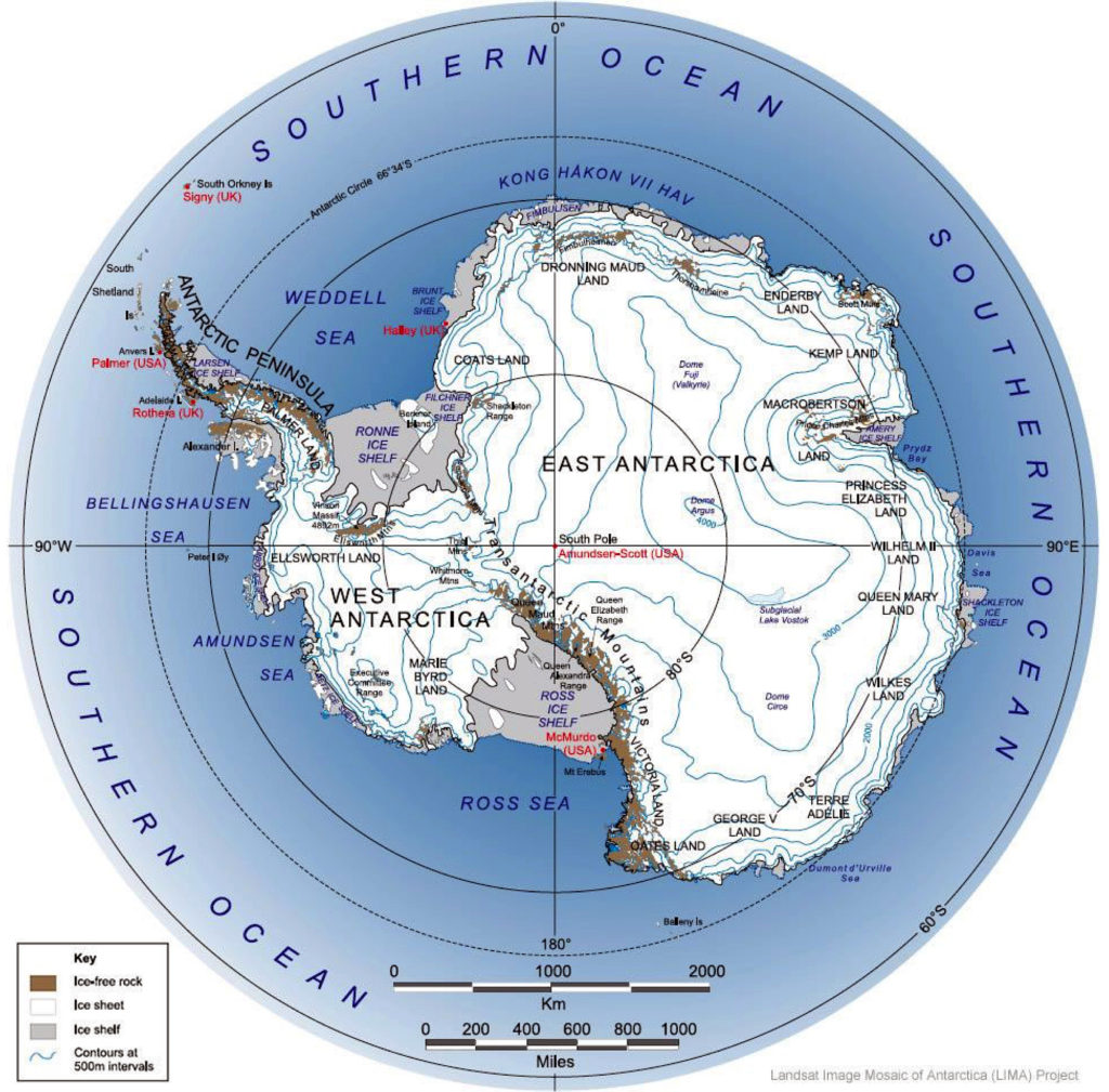
The following topographical map presents the surface of Antarctica in more detail, and shows the many ice shelves (in grey) that extend beyond the actual coastline and into the sea. The surface contour lines on the map are at 500 meter (1,640 ft) intervals.
Map of Antarctica and the Southern Ocean showing the topography of Antarctica (as blue lines), research stations of the United States and the United Kingdom (in red text), ice-free rock areas (in brown), ice shelves (in gray) and names of the major ocean water bodies (in blue uppercase text). Source: LIMA Project (Landsat Image Mosaic of Antarctica) via Wikipedia
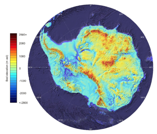
The highest elevation of the ice sheet is 4,093 m (13,428 ft) at Dome Argus (aka Dome A), which is located in the East Antarctic Ice Sheet, about 1,200 kilometers (746 miles) inland. The highest land elevation in Antarctica is Mount Vinson, which reaches 4,892 meters (16,050 ft) on the north part of a larger mountain range known as Vinson Massif, near the base of the Antarctic Peninsula. This topographical map does not provide information on the continental bed that underlies the massive ice sheets.
A look at the bedrock under the ice sheets: Bedmap2 and BedMachine
In 2001, the British Antarctic Survey (BAS) released a topographical map of the bedrock that underlies the Antarctic ice sheets and the coastal seabed derived from data collected by international consortia of scientists since the 1950s. The resulting dataset was called BEDMAP1.
In a 2013 paper, P. Fretwell, et al. (a very big team of co-authors), published the paper, “Bedmap2: Improved ice bed, surface and thickness datasets for Antarctica,” which included the following bed elevation map, with bed elevations color coded as indicated in the scale on the left. As you can see, large portions of the Antarctic “continental” bedrock are below sea level.
Bedmap2 bed elevation grid. Source: Fretwell 2013, Fig. 9
For an introduction to Antarctic ice sheet thickness, ice flows, and the topography of the underlying bedrock, please watch the following short (1:51) 2013 video, “Antarctic Bedrock,” by the National Aeronautics and Space Administration’s (NASA’s) Scientific Visualization Studio:
NASA explained:
“In 2013, BAS released an update of the topographic dataset called BEDMAP2 that incorporates twenty-five million measurements taken over the past two decades from the ground, air and space.”
“The topography of the bedrock under the Antarctic Ice Sheet is critical to understanding the dynamic motion of the ice sheet, its thickness and its influence on the surrounding ocean and global climate. This visualization compares the new BEDMAP2 dataset, released in 2013, to the original BEDMAP1 dataset, released in 2001, showing the improvements in resolution and coverage. This visualization highlights the contribution that NASA’s mission Operation IceBridge made to this important dataset.”
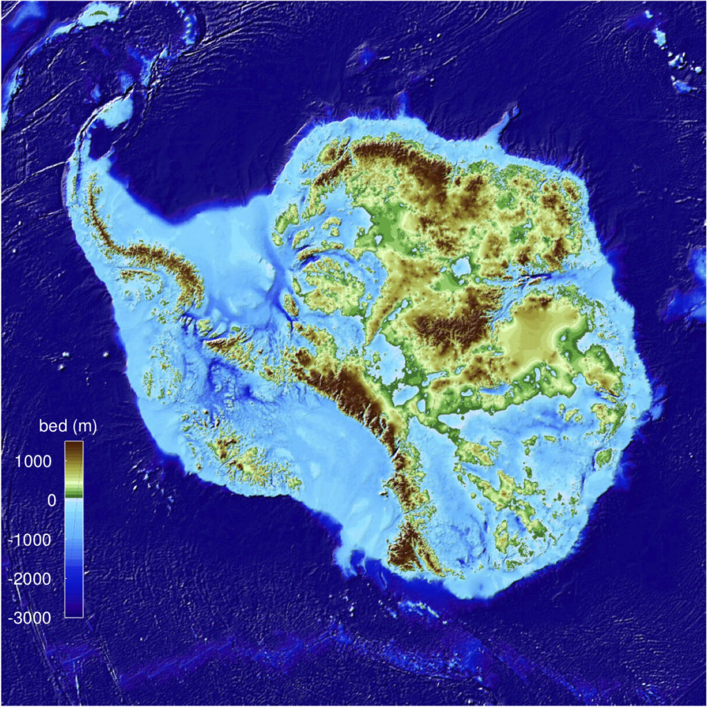
On 12 December 2019, a University of California Irvine (UCI)-led team of glaciologists unveiled the most accurate portrait yet of the contours of the land beneath Antarctica’s ice sheet. The new topographic map, named “BedMachine Antarctica,” is shown below.
BedMachine Antarctica topographical map showing the underlying ground features and the large portions of the continental bed that are below sea level. Credit: Mathieu Morlighem / UCI
UCI reported:
“The new Antarctic bed topography product was constructed using ice thickness data from 19 different research institutes dating back to 1967, encompassing nearly a million line-miles of radar soundings. In addition, BedMachine’s creators utilized ice shelf bathymetry measurements from NASA’s Operation IceBridge campaigns, as well as ice flow velocity and seismic information, where available. Some of this same data has been employed in other topography mapping projects, yielding similar results when viewed broadly.”
“By basing its results on ice surface velocity in addition to ice thickness data from radar soundings, BedMachine is able to present a more accurate, high-resolution depiction of the bed topography. This methodology has been successfully employed in Greenland in recent years, transforming cryosphere researchers’ understanding of ice dynamics, ocean circulation and the mechanisms of glacier retreat.”
“BedMachine relies on the fundamental physics-based method of mass conservation to discern what lies between the radar sounding lines, utilizing highly detailed information on ice flow motion that dictates how ice moves around the varied contours of the bed.”
The net result is a much higher resolution topographical map of the bedrock that underlies the Antarctic ice sheets. The authors note:“This transformative description of bed topography redefines the high- and lower-risk sectors for rapid sea level rise from Antarctica; it will also significantly impact model projections of sea level rise from Antarctica in the coming centuries.”
You can take a visual tour of BedMachine’s high-precision model of Antarctic’s ice bed topography here. Enjoy your trip.
There is significant geothermal heating under parts of Antarctica’s bedrock
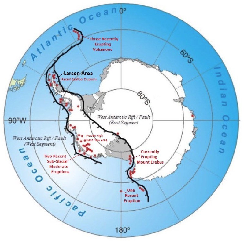
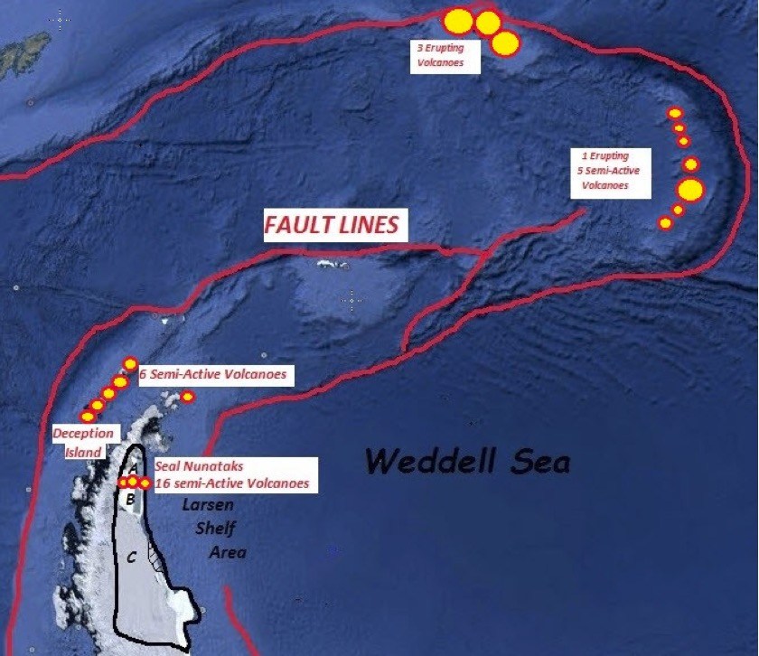
West Antarctica and the Antarctic Peninsula form a connected rift / fault zone that includes about 60 active and semi-active volcanoes, which are shown as red dots in the following map.
Volcanoes located along the branching West Antarctic Fault/Rift System. Source: James Kamis, Plate Climatology, 4 July 2017
In a 29 June 2018 article on the Plate Climatology website, author James Kamis presents evidence that the fault / rift system underlying West Antarctica generates a significant geothermal heat flow into the bedrock and is the source of volcanic eruptions and sub-glacial volcanic activity in the region. The heat flow into the bedrock and the observed volcanic activity both contribute to the glacial melting observed in the region. You can read this article here:
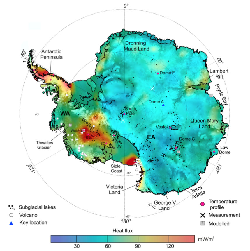
The correlation between the locations of the West Antarctic volcanoes and the regions of higher heat flux within the fault / rift system are evident in the following map, which was developed in 2017 by a multi-national team.
Geothermal heat flux distribution at the ice-rock interface superimposed on subglacial topography. Source: Martos, et al., Geophysical Research Letter 10.1002/2017GL075609, 30 Nov 2017
The authors note: “Direct observations of heat flux are difficult to obtain in Antarctica, and until now continent-wide heat flux maps have only been derived from low-resolution satellite magnetic and seismological data. We present a high-resolution heat flux map and associated uncertainty derived from spectral analysis of the most advanced continental compilation of airborne magnetic data. …. Our high-resolution heat flux map and its uncertainty distribution provide an important new boundary condition to be used in studies on future subglacial hydrology, ice sheet dynamics, and sea level change.” This Geophysical Research Letter is available here:
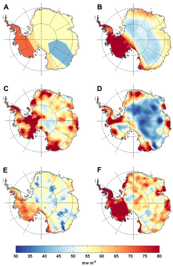
The results of six Antarctic heat flux models developed from 2004 to 2017 were compared by Brice Van Liefferinge in his 2018 PhD thesis. His results, shown below, are presented on the Cryosphere Sciences website of the European Sciences Union (EGU).
Spatial distributions of geothermal heat flux: (A) Pollard et al. (2005) constant values, (B) Shapiro and Ritzwoller (2004): seismic model, (C) Fox Maule et al. (2005): magnetic measurements, (D) Purucker (2013): magnetic measurements, (E) An et al. (2015): seismic model and (F) Martos et al. (2017): high resolution magnetic measurements. Source: Brice Van Liefferinge (2018) PhD Thesis.
Regarding his comparison of Antarctic heat flux models, Van Liefferinge reported:
“As a result, we know that the geology determines the magnitude of the geothermal heat flux and the geology is not homogeneous underneath the Antarctic Ice Sheet: West Antarctica and East Antarctica are significantly distinct in their crustal rock formation processes and ages.”
“To sum up, although all geothermal heat flux data sets agree on continent scales (with higher values under the West Antarctic ice sheet and lower values under East Antarctica), there is a lot of variability in the predicted geothermal heat flux from one data set to the next on smaller scales. A lot of work remains to be done …”
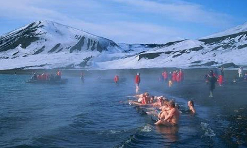
The effects of geothermal heating are particularly noticeable at Deception Island, which is part of a collapsed and still active volcanic crater near the tip of the Antarctic Peninsula. This high heat flow volcano is in the same major fault zone as the rapidly melting / breaking-up Larsen Ice Shelf. The following map shows the faults and volcanoes in this region.
Key geological features in the Larsen “C” sea ice segment area. Source: James Kamis, Plate Climatology, 4 July 2017Tourists enjoying the geothermally heated ocean water at Deception Island. Source: Public domain
So, if you take a cruise to Antarctica and the Cruise Director offers a “polar bear” plunge, I suggest that you wait until the ship arrives at Deception Island. Remember, this warm water is not due to climate change. You’re in a volcano.
Morlighem, M., Rignot, E., Binder, T. et al. “Deep glacial troughs and stabilizing ridges unveiled beneath the margins of the Antarctic ice sheet,” Nature Geoscience (2019) doi:10.1038/s41561-019-0510-8: https://www.nature.com/articles/s41561-019-0510-8
1. Overview of US military optical reconnaissance satellite programs
The National Reconnaissance Office (NRO) is responsible for developing and operating space reconnaissance systems and conducting intelligence-related activities for US national security. NRO developed several generations of classified Keyhole (KH) military optical reconnaissance satellites that have been the primary sources of Earth imagery for the US Department of Defense (DoD) and intelligence agencies. NRO’s website is here:
NRO’s early generations of Keyhole satellites were placed in low Earth orbits, acquired the desired photographic images on film during relatively short-duration missions, and then returned the film to Earth in small reentry capsules for airborne recovery. After recovery, the film was processed and analyzed. The first US military optical reconnaissance satellite program, code named CORONA, pioneered the development and refinement of the technologies, equipment and systems needed to deploy an operational orbital optical reconnaissance capability. The first successful CORONA film recovery occurred on 19 August 1960.
Specially modified US Air Force C-119J aircraft recovers a CORONA film canister in flight. Source: US Air Force
First reconnaissance picture taken in orbit and successfully recovered on Earth; taken on 18 August 1960 by a CORONA KH-1 satellite dubbed Discoverer 14. Image shows the Mys Shmidta airfield in the Chukotka region of the Russian Arctic, with a resolution of about 40 feet (12.2 meters). Source: Wikipedia
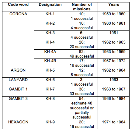
Keyhole satellites are identified by a code word and a “KH” designator, as summarized in the following table.
In 1976, NRO deployed its first electronic imaging optical reconnaissance satellite known as KENNEN KH-11 (renamed CRYSTAL in 1982), which eventually replaced the KH-9, and brought an end to reconnaissance satellite missions requiring film return. The KH-11 flies long-duration missions and returns its digital images in near real time to ground stations for processing and analysis. The KH-11, or an advanced version sometimes referred to as the KH-12, is operational today.
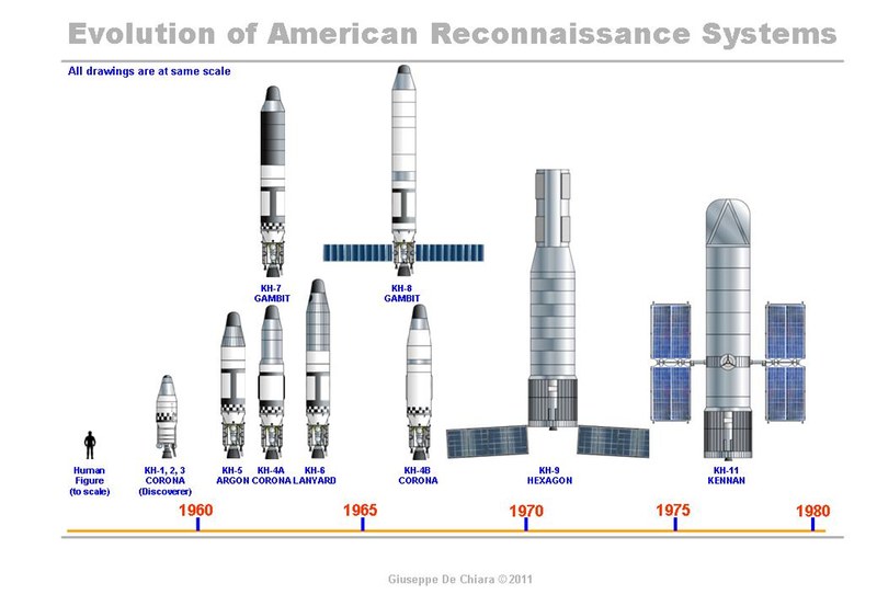
US film-return reconnaissance satellites from KH-1 to KH-9 shown to scale with the KH-11 electronic imaging reconaissance satellite. Credit: Giuseppe De Chiara and The Space Review.
Geospatial intelligence, or GEOINT, is the exploitation and analysis of imagery and geospatial information to describe, assess and visually depict physical features and geographically referenced activities on the Earth. GEOINT consists of imagery, imagery intelligence and geospatial information. Satellite imagery from Keyhole reconnaissance satellites is an important information source for national security-related GEOINT activities.
The National Geospatial-Intelligence Agency (NGA), which was formed in 2003, has the primary mission of collecting, analyzing, and distributing GEOINT in support of national security. NGA’s predecessor agencies, with comparable missions, were:
National Imagery and Mapping Agency (NIMA), 1996 – 2003
National Photographic Interpretation Center (NPIC), a joint project of the Central Intelligence Agency (CIA) and DoD, 1961 – 1996
2. The advent of the US civilian Earth observation programs
Collecting Earth imagery from orbit became an operational US military capability more than a decade before the start of the joint National Aeronautics & Space Administration (NASA) / US Geological Survey (USGS) civilian Landsat Earth observation program. The first Landsat satellite was launched on 23 July 1972 with two electronic observing systems, both of which had a spatial resolution of about 80 meters (262 feet).
Since 1972, Landsat satellites have continuously acquired low-to-moderate resolution digital images of the Earth’s land surface, providing long-term data about the status of natural resources and the environment. Resolution of the current generation multi-spectral scanner on Landsat 9 is 30 meters (98 feet) in visible light bands.
3. Declassification of certain military reconnaissance satellite imagery
All military reconnaissance satellite imagery was highly classified until 1995, when some imagery from early defense reconnaissance satellite programs was declassified. The USGS explains:
“The images were originally used for reconnaissance and to produce maps for U.S. intelligence agencies. In 1992, an Environmental Task Force evaluated the application of early satellite data for environmental studies. Since the CORONA, ARGON, and LANYARD data were no longer critical to national security and could be of historical value for global change research, the images were declassified by Executive Order 12951 in 1995”
Additional sets of military reconnaissance satellite imagery were declassified in 2002 and 2011 based on extensions of Executive Order 12951.
The declassified imagery is held by the following two organizations:
The original film is held by the National Archives and Records Administration (NARA).
Duplicate film held in the USGS Earth Resources Observation and Science (EROS) Center archive is used to produce digital copies of the imagery for distribution to users.
The declassified military satellite imagery available in the EROS archive is summarized below:
USGS EROS Archive – Declassified Satellite Imagery – 1 (1960 to 1972)
This set of photos, declassified in 1995, consists of more than 860,000 images of the Earth’s surface from the CORONA, ARGON, and LANYARD satellite systems.
CORONA image resolution improved from 40 feet (12.2 meters) for the KH-1 to about 6 feet (1.8 meters) for the KH-4B.
KH-5 ARGON image resolution was about 460 feet (140 meters).
KH-6 LANYARD image resolution was about 6 feet (1.8 meters).
USGS EROS Archive – Declassified Satellite Imagery – 2 (1963 to 1980)
This set of photos, declassified in 2002, consists of photographs from the KH-7 GAMBIT surveillance system and KH-9 HEXAGON mapping program.
KH-7 image resolution is 2 to 4 feet (0.6 to 1.2 meters). About 18,000 black-and-white images and 230 color images are available.
The KH-9 mapping camera was designed to support mapping requirements and exact positioning of geographical points. Not all KH-9 satellite missions included a mapping camera. Image resolution is 20 to 30 feet (6 to 9 meters); significantly better than the 98 feet (30 meter) resolution of LANDSAT imagery. About 29,000 mapping images are available.
USGS EROS Archive – Declassified Satellite Imagery – 3 (1971 to 1984)
This set of photos, declassified in 2011, consists of more photographs from the KH-9 HEXAGON mapping program. Image resolution is 20 to 30 feet (6 to 9 meters).
4. Example applications of declassified military reconnaissance satellite imagery
The declassified military reconnaissance satellite imagery provides views of the Earth starting in the early 1960s, more than a decade before civilian Earth observation satellites became operational. The military reconnaissance satellite imagery, except from ARGON KH-5, is higher resolution than is available today from Landsat civilian earth observation satellites. The declassified imagery is an important supplement to other Earth imagery sources. Several examples applications of the declassified imagery are described below.
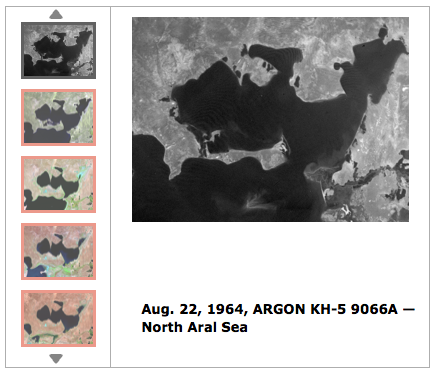
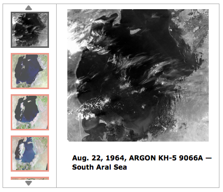
4.1 Assessing Aral Sea depletion
USGS reports: “The Aral Sea once covered about 68,000 square kilometers, a little bigger than the U.S. state of West Virginia. It was the 4th largest lake in the world. It is now only about 10% of the size it was in 1960…..In the 1990s, a dam was built to prevent North Aral water from flowing into the South Aral. It was rebuilt in 2005 and named the Kok-Aral Dam…..The North Aral has stabilized but the South Aral has continued to shrink and become saltier. Up until the 1960s, Aral Sea salinity was around 10 grams per liter, less than one-third the salinity of the ocean. The salinity level now exceeds 100 grams per liter in the South Aral, which is about three times saltier than the ocean.”
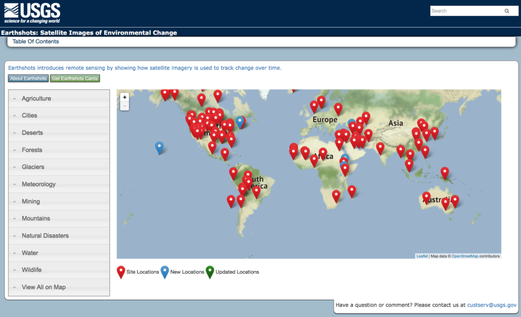
On the USGS website, the “Earthshots: Satellite Images of Environmental Change” webpages show the visible changes at many locations on Earth over a 50+ year time period. The table of contents to the Earthshots webpages is shown below and is at the following link: http:// https://earthshots.usgs.gov/earthshots/
USGS Earthshots Table of Contents
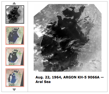
For the Aral Sea region, the Earthshots photo sequences start with ARGON KH-5 photos taken in 1964. Below are three screenshots of the USGS Earthshots pages showing the KH-5 images for the whole the Aral Sea, the North Aral Sea region and the South Aral Sea region. You can explore the Aral Sea Earthshots photo sequences at the following link: https://earthshots.usgs.gov/earthshots/node/91#ad-image-0-0
4.2 Assessing Antarctic ice shelf condition
In a 7 June 2016 article entitled, ”Spy satellites reveal early start to Antarctic ice shelf collapse,” Thomas Sumner reported:
“Analyzing declassified images from spy satellites, researchers discovered that the downhill flow of ice on Antarctica’s Larsen B ice shelf was already accelerating as early as the 1960s and ’70s. By the late 1980s, the average ice velocity at the front of the shelf was around 20 percent faster than in the preceding decades,….”
Satellite images taken by the ARGON KH-5 satellite have revealed how the accelerated movement that triggered the collapse of the Larsen B ice shelf on the east side of the Antarctic Peninsula began in the 1960s. The declassified images taken by the satellite on 29 August 1963 and 1 September 1963 are pictured right. Source: Daily Mail, 10 June 2016
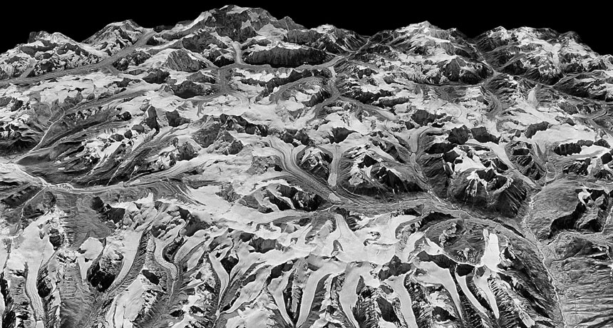
4.3 Assessing Himalayan glacier condition
In a 19 June 2019 paper “Acceleration of ice loss across the Himalayas over the past 40 years,” the authors, reported on the use of HEXAGON KH-9 mapping camera imagery to improve their understanding of trends affecting the Himalayan glaciers from 1975 to 2016:
“Himalayan glaciers supply meltwater to densely populated catchments in South Asia, and regional observations of glacier change over multiple decades are needed to understand climate drivers and assess resulting impacts on glacier-fed rivers. Here, we quantify changes in ice thickness during the intervals 1975–2000 and 2000–2016 across the Himalayas, using a set of digital elevation models derived from cold war–era spy satellite film and modern stereo satellite imagery.”
“The majority of the KH-9 images here were acquired within a 3-year interval (1973–1976), and we processed a total of 42 images to provide sufficient spatial coverage.”
“We observe consistent ice loss along the entire 2000-km transect for both intervals and find a doubling of the average loss rate during 2000–2016.”
“Our compilation includes glaciers comprising approximately 34% of the total glacierized area in the region, which represents roughly 55% of the total ice volume based on recent ice thickness estimates.”
3-D image of the Himalayas derived from HEXAGON KH-9 satellite mapping photographs taken on December 20, 1975.Source: J. M. Maurer/LDEO
4.4 Discovering archaeological sites
A. CORONA Atlas Project
The Center for Advanced Spatial Technologies, a University of Arkansas / U.S. Geological Survey collaboration, has undertaken the CORONA Atlas Project using military reconnaissance satellite imagery to create the “CORONA Atlas & Referencing System”. The current Atlas focuses on the Middle East and a small area of Peru, and is derived from 1,024 CORONA images taken on 50 missions. The Atlas contains 833 archaeological sites.
“In regions like the Middle East, CORONA imagery is particularly important for archaeology because urban development, agricultural intensification, and reservoir construction over the past several decades have obscured or destroyed countless archaeological sites and other ancient features such as roads and canals. These sites are often clearly visible on CORONA imagery, enabling researchers to map sites that have been lost and to discover many that have never before been documented. However, the unique imaging geometry of the CORONA satellite cameras, which produced long, narrow film strips, makes correcting spatial distortions in the images very challenging and has therefore limited their use by researchers.”
Screenshot of the CORONA Atlas showing regions in the Middle East with data available.
CAST reports that they have “developed methods for efficient
orthorectification of CORONA imagery and now provides free public access to our imagery database for non-commercial use. Images can be viewed online and full resolution images can be downloaded in NITF format.”
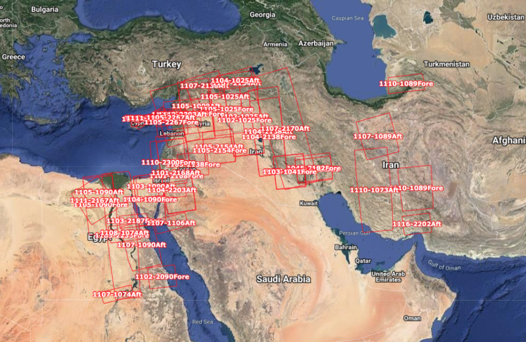
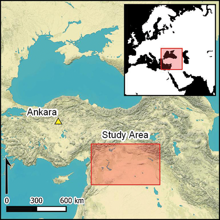
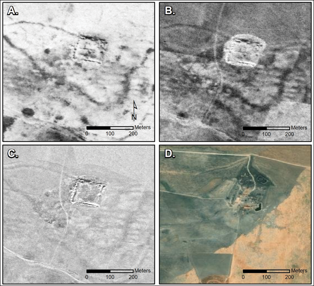
In October 2023, a team from Dartmouth College published a paper that described their recent discovery of 396 Roman-era forts using declassified CORONA and HEXAGON spy satellite imagery of regions of Syria, Iraq and nearby “fertile crescent” territories of the eastern Mediterranean. The study area is shown in the following map. A previous aerial survey of the area in 1934 had identified 116 other forts in the same region.
Dartmouth study area. Source: J. Casana, et al. (26 October 2023)
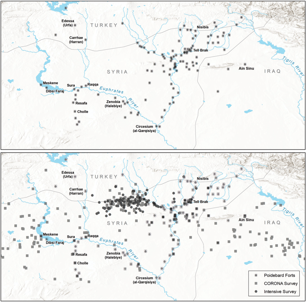
The authors noted, “Perhaps the most significant realization from our work concerns the spatial distribution of the forts across the landscape, as this has major implications for our understanding of their intended purpose as well as for the administration of the eastern Roman frontier more generally.”
Comparison of the distribution of forts documented in the 1934 aerial survey (top)and forts found recently on declassified satellite imagery (bottom).Source: Figure 9, J. Casana, et al. (26 October 2023)
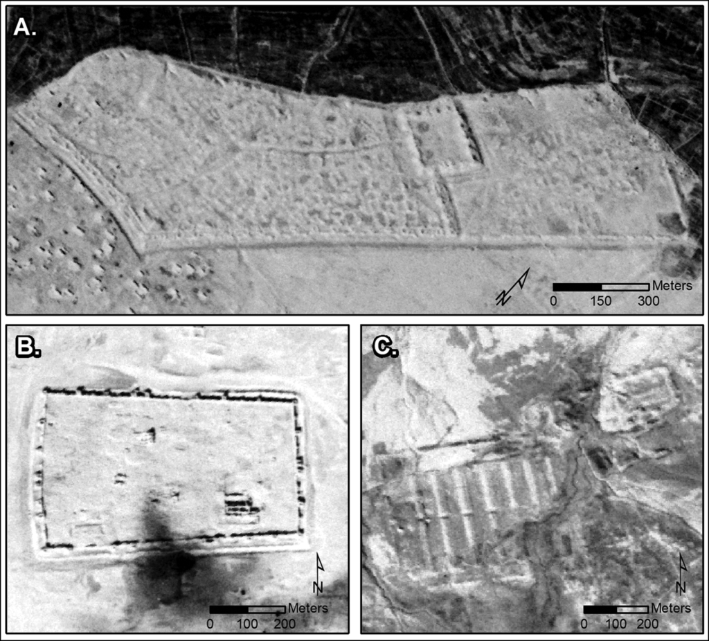
Examples of the new forts identified by the Dartmouth team in satellite imagery are shown in the following figures.
CORONA images showing three major sites: (A) Sura (NASA1401); (B) Resafa (NASA1398); and (C) Ain Sinu (CRN999).Source: Figure 3, J. Casana, et al. (26 October 2023)
Castellum at Tell Brak site in multiple images: (A) CORONA (1102, 17 December 1967); (B) CORONA (1105, 4 November 1968); (C) HEXAGON (1204, 17 November 1974); and (D) modern satellite imagery. Source: Figure 4, J. Casana, et al. (26 October 2023)
The teams paper concludes: “Finally, the discovery of such a large number of previously undocumented ancient forts in this well-studied region of the Near East is a testament to the power of remote-sensing technologies as transformative tools in contemporary archaeological research.”
4.5 Conducting commercial geospatial analytics over a broader period of time
The firm Orbital Insight, founded in 2013, is an example of commercial firms that are mining geospatial data and developing valuable information products for a wide range of customers. Orbital Insight reports:
“Orbital Insight turns millions of images into a big-picture understanding of Earth. Not only does this create unprecedented transparency, but it also empowers business and policy decision makers with new insights and unbiased knowledge of socio-economic trends. As the number of Earth-observing devices grows and their data output expands, Orbital Insight’s geospatial analytics platform finds observational truth in an interconnected world. We map out and quantify the world’s complexities so that organizations can make more informed decisions.”
“By applying artificial intelligence to satellite, UAV, and other geospatial data sources, we seek to discover and quantify societal and economic trends on Earth that are indistinguishable to the human eye. Combining this information with terrestrial data, such as mobile and location-based data, unlocks new sources of intelligence.”
5. Additional reading related to US optical reconnaissance satellites
You’ll find more information on the NRO’s film-return, optical reconnaissance satellites (KH-1 to KH-9) at the following links:
Robert Perry, “A History of Satellite Reconnaissance,” Volumes I to V, National Reconnaissance Office (NRO), various dates 1973 – 1974; released under FOIA and available for download on the NASA Spaceflight.com website, here: https://forum.nasaspaceflight.com/index.php?topic=20232.0
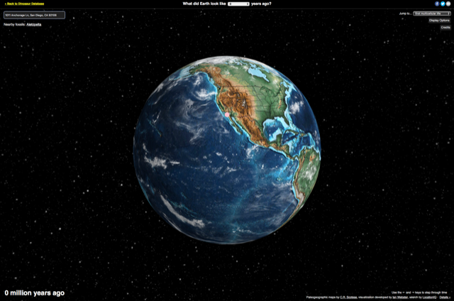
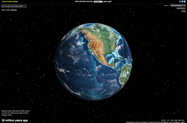
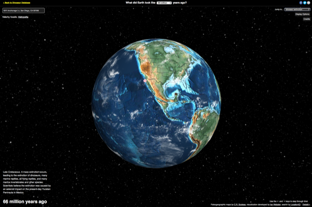
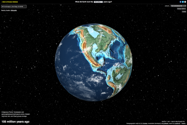
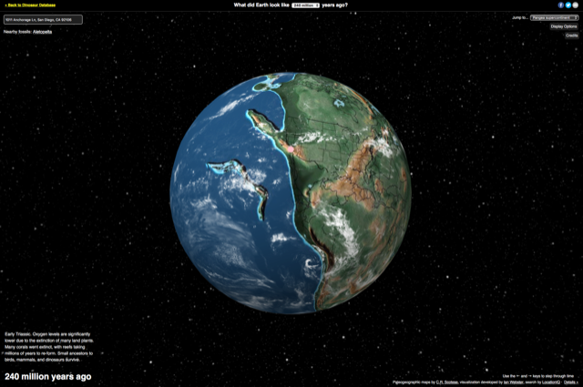
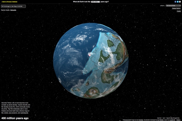
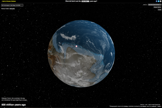
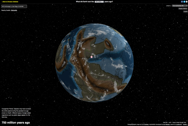
A 15 February 2019 article by Meilan Solly in the Smithsonian online magazine describes a recently released interactive map of the world that shows how the Earth’s continents have moved since 750 million years ago. With your cursor, you can zoom in and rotate the globe in any direction. Using a pull-down menu at the top center of the screen, you can see the relative positioning of the landmasses at the point in time you selected. A similar selection box in the upper right corner of the screen allows you to select a particular geological or evolutionary milestone (i.e., first land animals) in Earths’ development. Even better, you can enter an address in the text box in the upper-left corner of the screen and then see how your selected location has migrated as you explore through the ages.
Following are screenshots showing what’s happened to the Lyncean Group’s meeting site in San Diego during the past 750 million years.
I hope you enjoy the interactive globe, with visualization created and maintained by Ian Webster, plate tectonic and paleogeographic maps by C.R. Scotese, and the address search tool by LocationIQ.
Current world map20 million years ago66 million years ago – dinosaur extinction105 million years ago240 million years ago – Pangea supercontinent400 million years ago – first land animals. Looks like the first land animals couldn’t have emerged from the sea in San Diego.600 million years ago – Pannotia supercontinent750 million years ago
Representing the Earth’s 3-dimensional surface on a 2-dimensional map is a problem that has vexed cartographers through the ages. The difficulties in creating a 2D map of the world include maintaining continental shapes, distances, areas, and relative positions so the 2D map is useful for its intended purpose.
World map circa 1630. Source: World Maps Online
In this article, we’ll look at selected classical projection schemes for creating a 2D world map followed by polyhedral projection schemes, the newest of which, the AuthaGraph World Map, may yield the most accurate maps of the world.
1. Classical Projections
To get an appreciation for the large number of classical projection schemes that have been developed to create 2D world maps, I suggest that you start with a visit to the Radical Cartography website at the following link, where you’ll find descriptions of 31 classical projections (and 2 polyhedral projections).
It represents a line of constant course (rhumb line) as a straight line segments with a constant angle to the meridians on the map. Therefore, Mercator maps became the standard map projection for nautical purposes.
The linear scale of a Mercator map increases with latitude. This means that geographical objects further from the equator appear disproportionately larger than objects near the equator. You can see this in the relative size comparison of Greenland and Africa, below.
The size distortion on Mercator maps has led to significant criticism of this projection, primarily because it conveys a distorted perception of the overall geometry of the planet.
James Gail developed a cylindrical “equal area” projection that attempted to rectify the significant area distortions in Mercator projections. There are several similar cylindrical “equal-area” projection schemes that differ mainly in the scaling factor (standard parallel) used.
In 1967, German filmmaker Arno Peters “re-invented” the century old Gail equal-area projection and claimed that it better represented the interests of the many small nations in the equatorial region that were marginalized (at least in terms of area) in the Mercator projection. Arno’s focus was on the social stigma of this marginalization. UNESCO favors the Gail-Peters projection.
Source: By Strebe – Own work, CC BY-SA 3.0, https://commons.wikimedia.org/w/index.php?curid=16115242
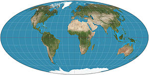
Mollweide equal-area projection
The key strength of this projection is in the accuracy of land areas, but with compromises in angle and shape. The central meridian is perpendicular to the equator and one-half the length of the equator. The whole earth is depicted in a proportional 2:1 ellipse
This projection is popular in maps depicting global distributions. Astronomers also use the Mollweide equal-area projection for maps of the night sky.
Source: Wikimedia Commons
An interrupted Mollweide map addresses the issue of shape distortion, while preserving the relative accuracy of land areas.
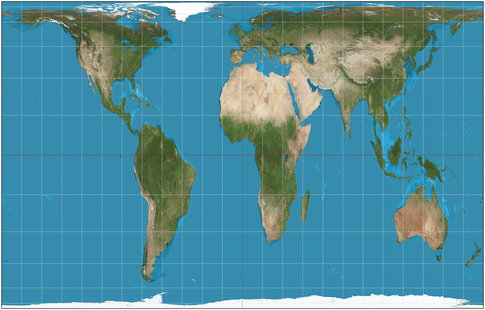
This projection is a combination of sinusoidal (to mid latitudes) and Mollweide at higher latitudes. It has no distortion along the equator or the vertical meridians in the middle latitudes. It was developed as a teaching replacement for Mercator maps. It is used by the U.S. Geologic Service (USGS) and also is found in many school atlases. The version shown below includes extensions repeating a few portions in order to show Greenland and eastern Russia uninterrupted.
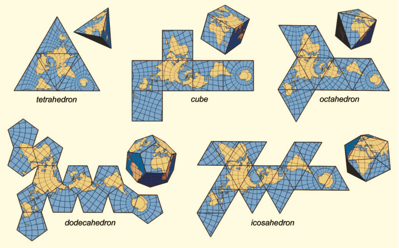
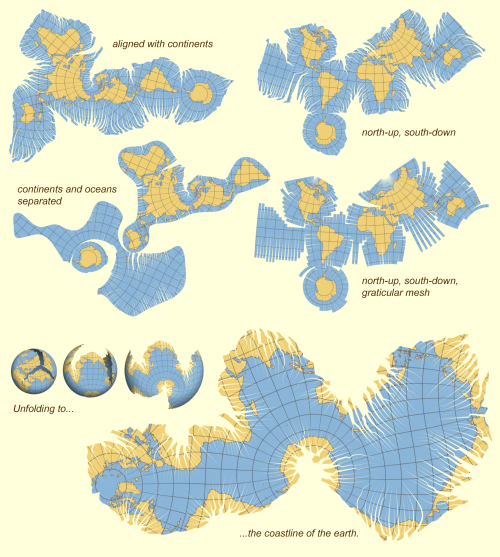
In his 1525 book, Underweysung der Messung (Painter’s Manual), German printmaker Abrecht Durer presented the earliest known examples of how a sphere could be represented by a polyhedron that could be unfolded to lie flat for printing. The polyhedral shapes he described included the icosahedron and the cuboctahedron.
While Durer did not apply these ideas at the time to cartography, his work laid the foundation for the use of complex polyhedral shapes to create 2D maps of the globe. Several examples are shown in the following diagram.
Source: J.J. van Wijk, “Unfolding the Earth: Myriahedral Projections”
Now we’ll take a look at the following polyhedral maps:
1909 Bernard J. S. Cahill’s butterfly map
1943 & 1954 R. Buckminster Fuller’s Dymaxion globe & map
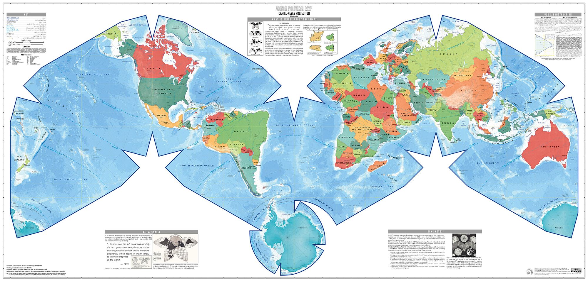
1975 Cahill-Keyes World Map
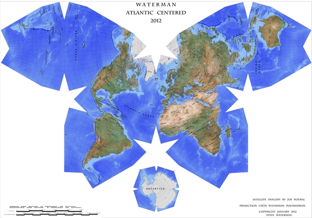
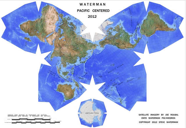
1996 Waterman polyhedron projections
2008 Jarke J. van Wijk myriahedral projection
2016 AuthaGraph World Map
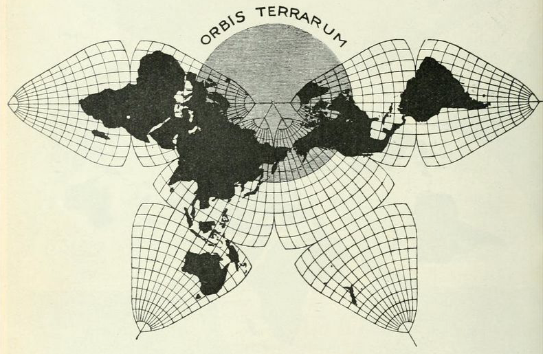
Bernard J. S. Cahill’s Butterfly Map
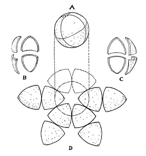
Cahill was the inventor of the “butterfly map,” which is comprised of eight symmetrical triangular lobes. The basic geometry of Cahill’s process for unfolding a globe into eight symmetrical octants and producing a butterfly map is shown in the following diagram made by Cahill in his original 1909 article on this mapping process.
The octants were arrayed four above and four below the equator. As shown below, the octant starting point in longitude (meridian) was strategically selected so all continents would be uninterrupted on the 2D map surface. This type of projection offered a 2D world map with much better fidelity to the globe than a Mercator projection.
Cahill’s 1909 map. Source: genekeys.com
You can read Cahill’s original 1909 article in the Scottish Geographical Magazine at the following link:
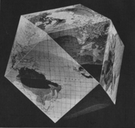
In the 1940s, R. Buckminster Fuller developed his approach for mapping the spherical globe onto a polyhedron. He first used a 14-sided cuboctahedron (8 triangular faces and 6 square faces), with each edge of the polyhedron representing a partial great circle on the globe. For each polyhedral face, Fuller developed his own projection of the corresponding surface of the globe. Fuller first published this map in Life magazine on 1 March 1943 along with cut-outs and instructions for assembling a polygonal globe.
Fuller’s 1943 Dymaxion map. Source: Life magazine
Fuller’s 1943 cuboctahedron Dymaxion globe. Source: Life magazine
You can see the complete Life magazine article, “R. Buckminster Fuller’s Dymaxion World,” at the following link:
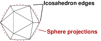
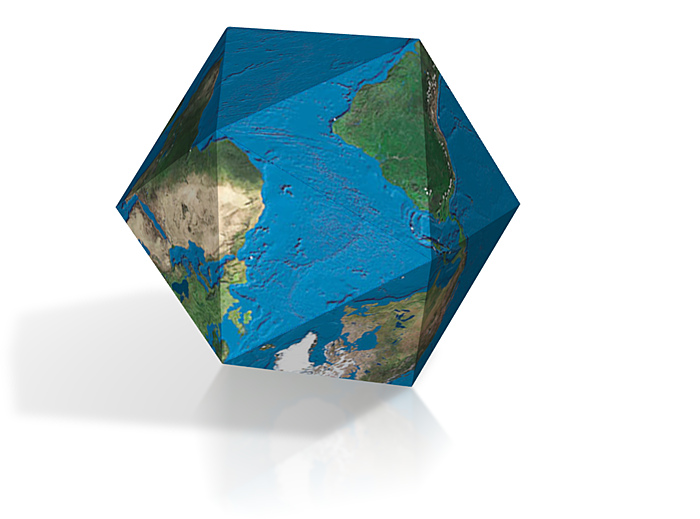
A later, improved version, known as the Airocean World Map, was published in 1954. This version of Fuller’s Dymaxion map, shown below, was based on a regular icosahedron, which has 20 triangular faces with each edge representing a partial great circle on a globe.
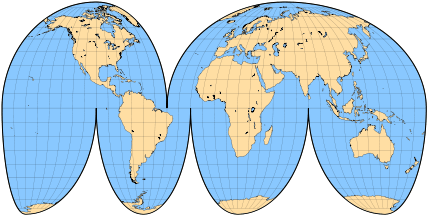
The Cahill–Keyes World Map developed in 1975 is an adaptation of the 1909 Cahill butterfly map. The Cahill-Keyes World map also is a polyhedral map comprised of eight symmetrical octants with a compromise treatment for Antarctica. Desirable characteristics include symmetry of component maps (octants) and scalability, which allows the map to continue to work well even at high resolution.
Source: http://imgur.com/GICCYmz
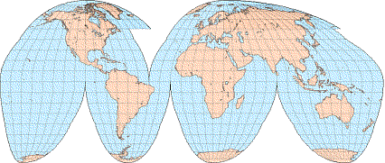
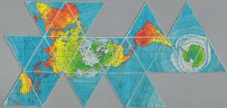
Waterman polyhedron projection maps
The Waterman polyhedron projection is another variation of the “butterfly” projection that is created by unfolding the globe into eight symmetric, truncated octahedrons plus a separate eight-sided piece for Antarctica. The Atlantic-centered projection and the comparable Pacific-centered projection are shown below.
“Shows the equator clearly, as well as continental shapes, distances (within 10 %), areas (within 10 %) angular distortions (within 20 degrees), and relative positions, as a compromise: statistically better than all other World maps.”
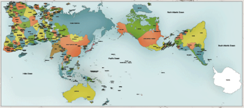
Myriahedral projection maps
A myriahedron is a polyhedron with a myriad of faces. This projection was developed in 2008 by Jarke J. van Wijk and is described in detail in the article, “Unfolding the Earth: Myriahedral Projections,” in the Cartographic Journal, which you can read at the following link:
The latest attempt to accurately map the globe on a 2D surface is the AuthaGraph World Map, made by equally dividing a spherical surface into 96 triangles, transferring it to a tetrahedron while maintaining areas proportions and unfolding it to be a rectangle. The developers explain the basic process as follows:
“…we developed an original world map called ‘AuthaGraph World Map’ which represents all oceans, continents including Antarctica which has been neglected in many existing maps in substantially proper sizes. These fit in a rectangular frame without interruptions and overlaps. The idea of this projection method was developed through an intensive research by modeling spheres and polyhedra. And then we applied the idea to cartography as one of the most useful applications.”
The AuthaGraph World Map. Source: AuthaGraph
For detailed information on this mapping process, I suggest that you start at the AuthaGraph home page:


