Category Archives: Economy

Top 15 Largest U.S. Companies by Revenue (1954-2018)

Peter Lobner

RankingTheWorld has created another fascinating timeline video, this one ranking the top 15 companies in the United States by revenue from 1954 to 2018. RTW explains that “the data is taken from the annual Fortune 500 list.  Fortune includes in its list all public and private companies that file financial statements with the government, and are incorporated and operate in the U.S.”  You’ll find their video here:

Within each calendar year, you’ll see quite a bit of volatility in the relative positioning within the top 15 companies, often with some companies falling below the top 15 threshold and new firms arriving to take their places.  

Through the 64 years of data, the changing complexion of U.S. industry is evident:

  • Decline in big manufacturing, with GM dropping from #3 to #13, Ford dropping from #4 to #12, and the loss of US Steel, General Electric, Bethlehem Steel and DuPont from the top 15 list.
  • Loss of food companies from the top 15 by the 1970s:  Armour and Swift & Company
  • Rapid rise of technology firms that weren’t even among the top 15 in 2010:  Apple, Amazon & Alphabet (Google’s parent).
  • Rapid rise in healthcare related service providers since 2010:  UnitedHealth Group, McKesson, CVS & AmeriSource Bergen.
  • Rise of big retailers since 2000:  Walmart & Costco
  • Persistence of some petrochemical companies:  Exxon Mobile (#2 in 1954 and in 2018) & Chevron

Following are screenshots from the RTW video that show an instant in the starting and ending years (1954 & 2018) and at the start of each decade in between. 

I think you’ll enjoy RTW’s five-minute video.  The detailed action happens quickly, so remember that you can use the YouTube Settings control to adjust playback speed.

Thanks to Lyncean member Mike Spaeth for letting me know about this RTW timeline video.  

You can watch all of RTW’s videos on their YouTube channel here: https://www.youtube.com/channel/UCFRoQ_PH8Ho5bUQb443PPqw

Worldwide Gross Domestic Product (GDP) Trends, 1960 – 2017, and Projections, 2018 – 2100

Peter Lobner

Ian Fraser is an award-winning journalist, commentator and broadcaster who writes about business, finance, politics and economics.  In 2018, under the banner of WawamuStats, he started posting a series of short videos that help visualize trends that are hard to see in voluminous numerical data, but become apparent (even a bit stunning) in a dynamic graphical format.  On its Facebook page, WawamuStats explains:

“Historical data are fun, but reading them is tedious. This page makes these tedious data into a dynamic timeline, which shows historical data.”

Regarding the GDP data used for the dynamic visualizations, WawamuStats states:

“Gross Domestic Product (GDP) is a monetary measure of the market value of all the final goods and services produced in a period of time, often annually or quarterly. Nominal GDP estimates are commonly used to determine the economic performance of a whole country or region, and to make international comparisons.”

Here are the three WawamuStats GDP videos I think you will enjoy.

Top 10 Country GDP Ranking History (1960-2017)

This dynamic visualization shows the top 10 countries with the highest GDP from 1960 to 2017.  At the start, most of the top 10 countries are from Europe and North America. You’ll see the rapid rise of Japan’s economy followed decades later by the rapid rise of China’s economy.

Top 10 Country GDP Per Capita Ranking History (1962-2017)

This dynamic visualization shows the top 10 countries with the highest GDP per capita from 1962 to 2017.  As you will see, most of the top 10 countries are from developed regions in Europe, North America, and Asia. Since 2017, Luxembourg has been regarded as the richest country in terms of GDP per capita.

Future Top 10 Country Projected GDP Ranking (2018-2100)

This dynamic visualization shows how Asian economies are expected to grow and eventually dominate the world economy, with China’s economy, and later India’s economy, exceeding the US economy in terms of GDP, and several European economies dropping out of the top 10 ranking. While the specific national GDP values are only projections, the macro trends, with a strong shift toward Asian economies, probably is correct.

You can find additional dynamic video timelines on the WawamuStats Facebook page here:

https://www.facebook.com/WawamuStats/?ref=py_c

You’ll also can find more information on Ian Fraser on his personal website here:

http://www.ianfraser.org/biography/

Thanks to Lyncean member Mike Spaeth for bringing the WawamuStats dynamic visualizations to my attention.

Human Activities are Contributing to Global Carbon Dioxide Levels, but Possibly not in the Way You Think They Are

Peter Lobner

The Human Development Index (HDI), which is a measure of the quality of life, was developed in 1990 by the United Nations to enable cross-national comparisons of the state of human development. You can read about the HDI and download the UN’s annual Human Development Reports at the following link:

http://hdr.undp.org

As you might imagine, there are large HDI differences among the world’s many nations. In its 2016 Human Development Report, the following nations were at the top and bottom of the HDI international ranking:

  • The top five places in the global HDI rankings are: Norway (0.949), Australia (0.939), Switzerland (0.939), Germany (0.926) with Denmark and Singapore (0.925) sharing the 5th spot.
  • The bottom five countries in rank order of HDI are: Burundi (0.404), Burkina Faso (0.402), Chad (0.396), Niger (0.353) and Central African Republic (0.352).

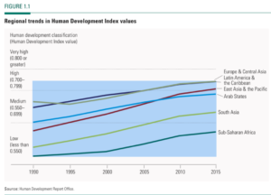
The UN reported that the regional HDI trends from 1990 to 2015 are up in all regions of the world, as shown in the following figure.

The U.S. Department of Energy (DOE) developed a general correlation between HDI and the annual per capita energy consumption in each nation, as shown in the following figure. Note that annual per capita energy consumption is not a factor in the UN’s determination of HDI.

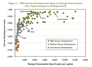
Source: DOE “Nuclear Energy Research & Development Roadmap – Report to Congress”,     April 2010

DOE reports:

“Figure 3 illustrates that a nation’s standard of living depends in part on energy consumption. Access to adequate energy is now and will continue to be required to achieve a high quality of life.”

Based on the 25-year HDI trends reported by the UN (Figure 1.1, above), nations generally have been moving up the HDI scale. Based on the DOE correlation (Figure 3, above), many of these nations, especially the least-developed nations, also should be moving up the scale for per capita energy consumption (to the right in the chart above) as their HDI increases. The net result should be a worldwide trend toward higher median per capita energy consumption. While conservation efforts may help reduce the per capita energy consumption in highly developed nations, there is a large fraction of the world’s population living in less developed nations. In these countries the per capita energy consumption will grow significantly as the local economies develop and the local populations demand basic goods and services that are commonplace in more developed nations.

In his commentary on global warming, Nobel laureate Dr. Ivar Giaever takes issue with CO2 being the cause of global warming by noting that the key “evidence” is a claimed global average temperature increase of 0.8 degrees (288 to 288.8 K) between 1880 and 2013 and a supposed correlation of this temperature increase with the increase of CO2 in the atmosphere. Dr. Giaever takes the position that measuring a worldwide average temperature trend is a difficult task, particularly with the modest number of measurement points available more than a hundred years ago, the consistency of measurement over the period of interest, and the still-modest number of measurement points in many parts of the world today. In addition, he notes that a 0.8 degree K change in worldwide average temperature over a period of 133 years seems to be a very high level of consistency rather than an alarming trend. During that same period, Dr. Giaever noted that world population increased from 1.5 to 7 billion and many human activities contributed to environmental change, yet the impacts of all these additional people are rarely mentioned in the climate change debate. You can watch one of Dr. Giaever lectures at the following link:

https://www.youtube.com/watch?v=SXxHfb66ZgM

What is the impact of having 5.5 billion more people in the world today (and their many ancestors for the past 133 years) on global CO2 emissions? That’s hard to determine, but a simpler starting point is to assess the impact of one additional person.

That matter was addressed in a 2017 article by Seth Wynes and Kimberly Nicholas entitled, “The climate mitigation gap: education and government recommendations miss the most effective individual actions,” which was published in Environmental Research Letters. The authors developed a ranking for a wide variety of human activities relative to their contribution to CO2 emission reduction measured in tonnes (metric tons, 2205 pounds) of CO2-equivalent per year. I can tell you that the results are surprising.

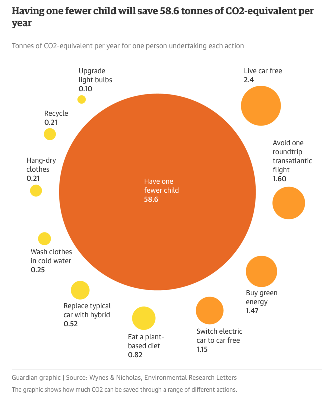
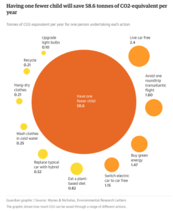
A synopsis of these results is published in The Guardian using the following simple graphic.

The study authors, Wynes and Nicholas, concluded:

“We recommend four widely applicable high-impact (i.e. low emissions) actions with the potential to contribute to systemic change and substantially reduce annual personal emissions: having one fewer child (an average for developed countries of 58.6 tonnes CO2-equivalent (tCO2e) emission reductions per year), living car-free (2.4 tCO2e saved per year), avoiding airplane travel (1.6 tCO2e saved per roundtrip transatlantic flight) and eating a plant-based diet (0.8 tCO2e saved per year). These actions have much greater potential to reduce emissions than commonly promoted strategies like comprehensive recycling (four times less effective than a plant-based diet) or changing household lightbulbs (eight times less).”

Surprise!! Population growth adds CO2 to the atmosphere and the biggest impact a person can have on their own carbon footprint is to not have an additional child.

The authors noted that average savings of 58.6 tCO2e per year for having one fewer child applies to developed countries, where we expect per-capita energy consumption to be high. In less developed nations, where we expect lower per-capita energy consumption, the average savings for having one fewer child will be smaller. However, as their HDI continues to increase, the per-capita energy consumption in less developed nations eventually will rise and may approach the values occurring now in medium- or high-developed countries.

You can read the synopsis of the Wynes and Nicholas analysis in The Guardian here:

https://www.theguardian.com/environment/2017/jul/12/want-to-fight-climate-change-have-fewer-children

You can read the full paper in Environmental Research Letters here:

http://iopscience.iop.org/article/10.1088/1748-9326/aa7541

The mathematical approach for estimating the CO2-equivalent per year of an additional child is based on a 2009 paper by Paul A. Murtaugh and Michael G. Schlax entitled, “Reproduction and the carbon legacies of individuals,” and published in Global Environmental Change. The authors state:

“Here we estimate the extra emissions of fossil carbon dioxide that an average individual causes when he or she chooses to have children. The summed emissions of a person’s descendants, weighted by their relatedness to him, may far exceed the lifetime emissions produced by the original parent.”

“It is important to remember that these analyses focus on the carbon legacies of individuals, not populations. For example, under the constant-emission scenario, an extra child born to a woman in the United States ultimately increases her carbon legacy by an amount (9441 metric tons) that is nearly seven times the analogous quantity for a woman in China (1384 tons), but, because of China’s enormous population size, its total carbon emissions (from its human population) currently exceed those of the United States.”

“…..ignoring the consequences of reproduction can lead to serious under-estimation of an individual’s long-term impact on the global environment.”

You can read this complete paper here:

https://www.biologicaldiversity.org/programs/population_and_sustainability/pdfs/OSUCarbonStudy.pdf

How’s your carbon legacy doing?

U.S. Reliance on Non-Fuel Mineral Imports

Peter Lobner

The U.S. Geologic Survey produces a series of mineral commodity annual reports and individual commodity data sheets. The web page for the index to these reports and data sheets is at the following link:

http://minerals.usgs.gov/minerals/pubs/mcs/

One particularly interesting document, with a very dull sounding title, is, Mineral Commodity Summaries 2015, which you can download for free at the following link:

http://minerals.usgs.gov/minerals/pubs/mcs/2015/mcs2015.pdf

This USGS report starts by putting the non-fuel mineral business sector in context with the greater U.S. economy. In the USGS chart below, you can see that the non-fuel mineral business sector makes up 13.5% of the U.S. economy. By dollar volume, net imports of processed mineral materials make up only a small portion (about 1.6%) of the non-fuel mineral business.

USGS role of minerals in the economy

In the, Mineral Commodity Summaries 2015, USGS also identified the U.S. reliance on non-fuel minerals imports. Their chart for 2014 is reproduced below.

USGS Net Import Reliance

Many of the above non-fuel minerals have very important uses in high-value products created in other business sectors.  A good summary table on this matter appears in the National Academies Press report entitled, Emerging Workforce Trends in the U.S. Energy and Mining Industries: A Call to Action, published in August 2015. You can view or download this report for free at the following link:

http://www.nap.edu/new/

In this report, refer to Table 2.5, Common or Essential Products and Some of Their Mineral Components.

Among the minerals with very important roles in modern electrical and electronic components and advanced metals is the family of rare earths, which is comprised of the 17 elements highlighted in the periodic table, below:

  • the 15 members of the Lanthanide series from 57La (Lanthanum) to 71Lu (Lutetium), and
  • the two Transitional elements 21Sc (Scandium) and 39Y (Yttrium).

Periodic Table - Rare Earths

Source: www.rareelementresources.com/

In the above 2014 import reliance chart, USGS reported that the U.S. continued to be a net importer of rare earth minerals (overall, 59% reliant), and that for Scandium the U.S was 100% reliant on imports.

In the Mineral Commodity Summaries 2015, USGS reported the following usage of rare earth minerals in the U.S.:

  • General uses: catalysts, 60%; metallurgical applications and alloys, 10%; permanent magnets, 10%; glass polishing, 10%; and other, 10%.
  • Scandium principal uses: solid oxide fuel cells (SOFCs) and aluminum-scandium alloys. Other uses are in ceramics, electronics, lasers, lighting, and radioactive isotopes used as a tracing agent in oil refining

China became the world’s dominant producer of rare earths in the 1990s, replacing U.S. domestic producers, none of which could not compete economically with the lower prices offered by the Chinese producers.

On March 22, 2015, the CBS TV show 60 Minutes featured a segment on the importance of rare earth elements and underscored the need to ensure a domestic supply chain of these critical minerals. You can view this segment at the following link:

https://www.youtube.com/watch?v=N1HiX0HiAuo

In December 2011, the U.S. Department of Energy (DOE) issued a report entitled Critical Materials Strategy, which you can download for free at the following link:

http://energy.gov/sites/prod/files/DOE_CMS2011_FINAL_Full.pdf

The summary results of the DOE “criticality assessment” are reproduced below

“Sixteen elements were assessed for criticality in wind turbines, EVs (electric vehicles), PV (photovoltaic) cells and fluorescent lighting. The methodology used was adapted from one developed by the National Academy of Sciences. The criticality assessment was framed in two dimensions: importance to clean energy and supply risk. Five rare earth elements (REEs)—dysprosium, terbium, europium, neodymium and yttrium—were found to be critical in the short term (present–2015). These five REEs are used in magnets for wind turbines and electric vehicles or phosphors in energy-efficient lighting. Other elements—cerium, indium, lanthanum and tellurium—were found to be near-critical. Between the short term and the medium term (2015– 2025), the importance to clean energy and supply risk shift for some materials (Figures ES-1 and ES-2).”

DOE Critical Materials Strategy

While the results of the DOE criticality assessment focused on importance to the energy sector, the identified mineral shortages will impact all business sectors that depend on these minerals, including consumer electronics and national defense.

Further insight on the importance of rare earths is provided by an annual report to the Senate Select Committee on Intelligence entitled, U.S. Intelligence Community Worldwide Threat Assessment Statement for the Record. The report delivered on March 12, 2013 highlighted the national security threat presented by China’s monopoly on rare earth elements. You can download that report at the following link:

https://www.hsdl.org/?view&did=732599

The 2013 threat assessment offered the following perspective on the strategic importance of rare earth minerals:

“Rare earth elements (REE) are essential to civilian and military technologies and to the 21st century global economy, including development of green technologies and advanced defense systems. China holds a commanding monopoly over world REE supplies, controlling about 95 percent of mined production and refining. China’s dominance and policies on pricing and exports are leading other countries to pursue mitigation strategies, but those strategies probably will have only limited impact within the next five years and will almost certainly not end Chinese REE dominance.”

 While the above focus has been on rare earths, the discussion serves to illustrate that the U.S. is dependent on importing many minerals that are very important to the national economy.

New Report Quantifies the Value of Nuclear Power Plants to the U.S. Economy and Their Contribution to Limiting Greenhouse Gas (GHG) Emissions

Peter Lobner

On 2 July 2015, I made a long post entitled, “EPA Clean Power Plan Proposed Rule Does Not Adequately Recognize the Role of Nuclear Power in Greenhouse Gas Reduction.”

On 7 July 2015, Nuclear Matters (http://www.nuclearmatters.com) issued a related,  comprehensive report, prepared by economists from The Brattle Group (http://www.brattle.com), that quantifies the significant value of nuclear power plants to the U.S. economy and the contribution made to limiting greenhouse gas (GHG) emissions. Their report’s findings include:

  • U.S. nuclear energy plants contribute $60 billion annually to gross domestic product (GDP), in addition to other economic and societal benefits.
  • The nuclear industry accounts for about 475,000 full-time jobs (direct and secondary).
  • Energy generated from nuclear plants avoids emissions that otherwise would have been generated by fossil power plants.
    • 573 million tons of carbon dioxide (CO2) emissions, worth an additional $25 billion annually if valued at the U.S. government’s estimate for the social cost of carbon.
    • 650,000 tons of nitrogen oxides (NOX) and over one million tons of sulfur dioxide (SO2) emissions annually, together valued at $8.4 billion using the National Academy of Science’s externality estimates.
  • Nuclear power helps keep electricity prices low. Without nuclear power, retail electricity rates could increase by about 6% on average. Keeping electricity prices low is the primary means by which nuclear power boosts the economy.
  • Provides $10 billion in federal tax revenues and $2.2 billion in state tax revenues annually.

You can download the report, entitled, The Nuclear Industry’s Contribution to the U.S. Economy” at the link below.  The report also describes the modeling techniques used to estimate economic value with and without the contributions from nuclear power.

http://www.brattle.com/system/news/pdfs/000/000/895/original/The_Nuclear_Industry’s_Contribution_to_the_U.S._Economy.pdf?1436280444

Brattle-Group-nuc-power-economics-report-7-Jul-15 R1

World Bank Open Data Website Provides Free Access to Data About Development in Countries Around the Globe

Peter Lobner

You can access World Bank Open Data at the following link:

http://data.worldbank.org

Your basic navigation options are shown below:

World Bank web site navigation

As an example of what you can find, I selected the “Indicators” tab, then looked under the “Infrastructure” heading and found that data on “Internet users (per 100 people)” were available. These data are viewable in different formats (tabular, map, graph). The map results for the period 2010 – 2014 are shown below:

World Bank internet usage 2010 - 2014

Resolution is at the country level, so the country-wide average values are not representative of usage in remote areas of the country (i.e., the Canadian northern territories).  Nonetheless, the map of the global distribution of Internet users is an interesting result that is quickly available from World Bank data.

The World Bank website look like an interesting site to explore at your leisure.